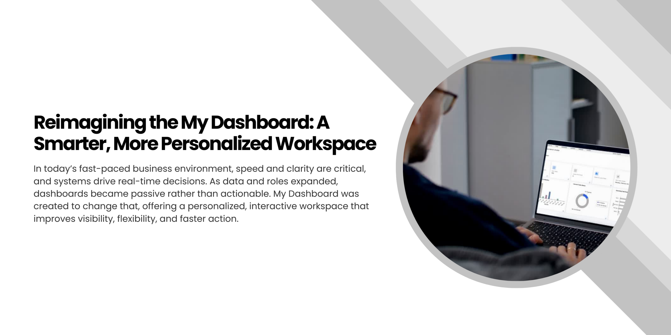
Reimagining the My Dashboard: A Smarter, More Personalized Workspace
In today’s business environment, speed isn’t a luxury, it’s a necessity, and clarity isn’t a bonus, it’s what keeps work moving. Systems are no longer just places where data lives; they’re where decisions happen, where priorities shift, and where the day unfolds in real time.
But as data grows and roles evolve, a dashboard can easily become what it was never meant to be: a passive screen filled with numbers, instead of an active space that helps people think, decide, and act.
That realization shaped this transformation. It led to the launch of My Dashboard, our customized, employee-focused workspace, redesigned as a more personalized, interactive environment built around visibility, flexibility, and real-world usage patterns.
What the Dashboard Was and Why It Needed Change
The earlier dashboard did its job; it provided access to important system data. But access alone isn’t the same as clarity.
Information was often spread across modules and screens. To understand the full picture, employees had to navigate, switch context, and manually connect dots. Over time, those extra steps added up as quiet interruptions to workflow.
As usage expanded and responsibilities became more dynamic, certain needs stood out:
- Important metrics needed to live together, not in separate corners
- Information hierarchy needed to guide attention, not compete for it
- Different roles needed different focal points
- The dashboard needed to adjust to people, not expect people to adjust to it
The goal that emerged was simple: turn the “My Dashboard” from a starting point into a true working space, where monitoring, understanding, and action naturally happen together.
What We Changed
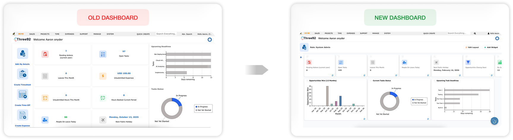
My dashboard is no longer treated as a single information surface. It’s designed as a layered workspace where employees move naturally from orientation to priorities to deeper insight, all within one screen, without losing their place.
A Structured, Purpose-Driven Layout
Information is now organized into clear functional zones that reflect how people actually move through their day, from “Where am I?” to “What needs attention?” to “What does this mean?”
A collapsible shortcuts panel on the left provides direct access to frequently used modules and screens. It reduces repetitive navigation and puts control in the user’s hands: keep it open for speed, or collapse it for focus.
At the top, the user profile section adds a subtle but important layer of context. Role and profile details are visible, with quick access to the full employee profile. It’s a small shift, but it connects system activity to the person behind it, turning the dashboard from a generic interface into a personal workspace.
KPIs That Bring Priorities Forward
Directly below,we shift from orientation to performance. A horizontally scrollable KPI row presents key indicators as compact, scannable cards. The layout stays clean, but flexible enough to grow as new metrics become important.
The addition of Opportunities Closing Soon and Sales Activities brings urgency and activity into clear view. Instead of searching for what needs attention, employees can feel it immediately, seeing workload, progress, and pressure points at a glance.
From Numbers to Insight: The Chart Section
Below the KPI row, visuals translate system data into patterns and perspective. Task status, upcoming deadlines, and performance trends, including the Opportunities Won chart, become easier to understand because they can be seen, not just read.
Together, KPIs and charts support a natural rhythm of work:
see the signals to understand the patterns to act with clarity.
Shaped by Everyday Work Challenges
This redesign wasn’t driven by aesthetics. It was shaped by the small, repeated friction points employees face every day.
Information that once required switching screens now lives together. Priorities that once demanded interpretation surfaced more clearly. Structure replaces clutter, helping users focus without feeling buried in data.
These challenges revealed something essential: our dashboard must do more than display information. It must support how people actually think and work, which changes from role to role, and even hour to hour.
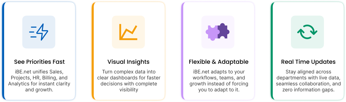
Designed for Adaptability and Control
To meet that reality, flexibility is built into the core experience.
Users can rearrange KPIs, charts, and shortcuts through intuitive
Each KPI and chart also includes a refresh function, ensuring employees can pull the latest data whenever they need it. This way the dashboard stays current, responsive, and aligned with real-time activity. It adjusts to the user, to the task, and to the moment.
From Dashboard to Operational Workspace
With clearer structure, visible priorities, and built-in flexibility, My Dashboard now supports the full rhythm of daily work. Orientation, analysis, and action are no longer separate stages, they flow together in one connected environment.
This shift represents more than an interface change. It reflects an ongoing commitment to designing systems around real working behavior where clarity reduces hesitation, and the right information at the right moment leads to better decisions.
Our dashboard is no longer just where users begin. It’s where work moves forward. And as roles evolve and expectations grow, this workspace is built to evolve with them, staying relevant, intuitive, and aligned with the people who rely on it every day.