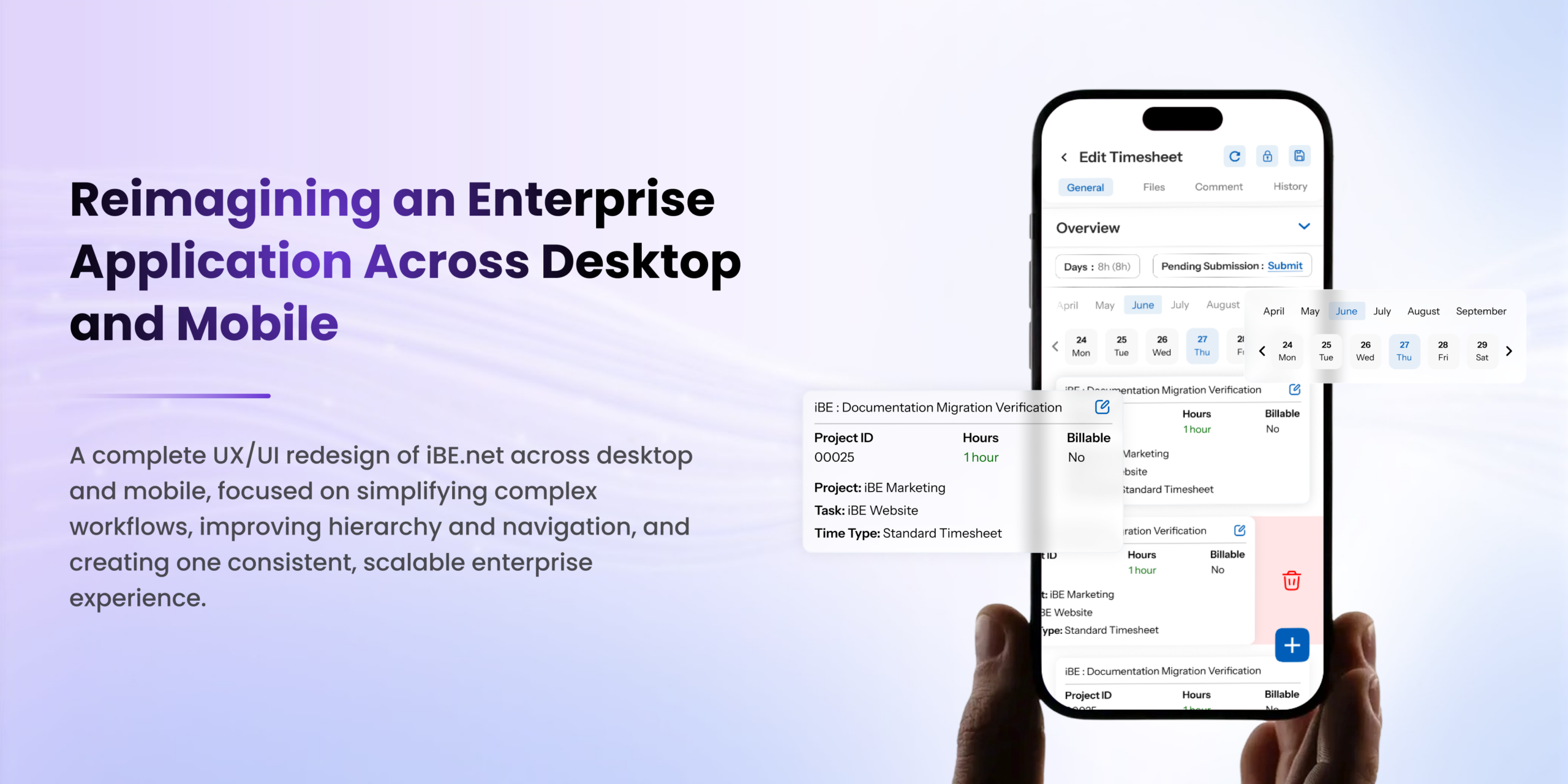
Reimagining an Enterprise Application Across Web and Mobile
Overview
iBE.net is a comprehensive enterprise platform designed to support a wide range of business functions, workflows, and data-rich operations.
As the platform continued to grow around evolving business requirements, there was an opportunity to further refine how users interact with the product across its different modules and workflows. The existing experience provided a strong functional foundation, while the redesign focused on improving consistency, hierarchy, navigation, and adaptability for modern enterprise usage.
Keeping these objectives in mind, we designed a comprehensive UX/UI redesign across both desktop and mobile, looking beyond individual screens to rethink and improve the broader product experience.
The redesign covered key areas including Dashboard, Search, Opportunities, Timesheets, Customer Portal, Sales, Jobs, Reports, HR & Admin, Procurement, and other core workflows.
The objective was not to replace what already worked, but to build on the existing experience and make iBE.net feel like one connected, scalable product across different screens, workflows, and user needs.
The Challenge
The challenge was not simply to change the visual appearance of the existing product.
The bigger opportunity was understanding how an already feature-rich enterprise platform could evolve as the product, its workflows, and its users continued to grow.
iBE.net contains a large amount of business-critical information, so removing information was not the answer. Instead, the focus was on organizing that complexity in a way that made the experience easier to understand, scan, and navigate while preserving the depth and functionality required by enterprise users.
Several opportunities became clear across the product.
Information Density
Large tables and data-heavy screens contained significant amounts of important information. The opportunity was to create stronger hierarchy and grouping so users could scan and understand this information more efficiently without losing valuable details.
Consistent Experience
Different sections of the application had evolved around their individual workflows. The redesign focused on bringing these experiences closer together through shared interaction patterns, components, and visual conventions.
Stronger Hierarchy
With so much information available within enterprise workflows, users benefit from knowing what deserves attention first. The redesign introduced clearer hierarchy between primary information, secondary content, actions, and supporting details.
Evolving Navigation
The existing product primarily used a top navigation structure, which was well suited to the original product experience.
As the platform expanded and the number of modules and workflows increased, there was an opportunity to introduce a more modern and flexible navigation approach.
Rather than replacing the existing navigation entirely, the redesign introduced a combination of top navigation and persistent left navigation.
This allowed the system to support different user preferences and contexts.
The top navigation continued to provide quick access to global areas and important functions, while the left navigation provided persistent access to the broader set of modules and product areas. This approach gave users more flexibility instead of forcing everyone into a single navigation pattern.
Multi-Device Experience
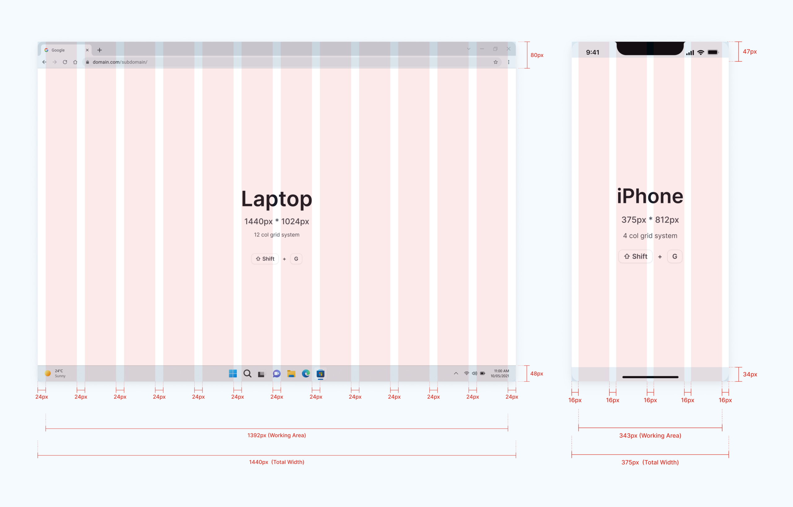
The existing experience was primarily designed around larger screens. As users increasingly needed access to workflows across different devices, there was an opportunity to extend the experience to mobile without compromising the functionality of the desktop product.
Evolving Visual Language
The product already had an established visual identity and set of interface patterns. The redesign focused on refining and connecting these patterns into a more cohesive design language that could scale across the growing product.
The Goal
The goal was not simply to make iBE.net look more modern.
It was to evolve the existing experience into a clearer, more connected, and more flexible enterprise application while preserving the functionality and familiarity users already depended on.
The redesign focused on creating a consistent design language across the product while maintaining the depth required by enterprise workflows.
Four principles guided the redesign:
Clarity→Consistency→Efficiency→Scalability
These principles helped shape decisions across navigation, information architecture, components, workflows, and responsive experiences.
One System, Refined Across the Product
iBE.net already had established patterns and reusable components across its different product areas. The redesign focused on refining and strengthening these patterns to create greater consistency and a more cohesive experience.
This included improvements across:
- Navigation
- Search
- Filters
- Tables
- Forms
- Status indicators
- Buttons
- Cards
- Modals
- Inputs
- Empty states
- Notifications
- Data visualization
The goal was not to introduce an entirely new system, but to build on what was already there and make it more consistent, scalable, and polished.
Similar interactions were refined to feel more familiar across different areas of the product, while still allowing individual workflows to maintain their specific requirements.
The result was a more connected experience where users could move between different sections with greater consistency and less need to adapt to different interaction patterns.
UX Principles Behind the Redesign
The redesign was guided by established UX principles and behavioral laws, not just visual preferences.
Jakob’s Law
Users bring expectations from the digital products they already know.
Rather than asking users to learn unfamiliar enterprise patterns, the redesign introduced familiar interactions such as persistent navigation, recognizable search behavior, standard filtering, familiar tables, clear action hierarchy, and predictable interactions.
The objective was to make the product feel intuitive by building on patterns users already understand.
This included the introduction of a persistent left navigation alongside the existing top navigation, creating a more familiar structure for modern enterprise applications while retaining access to global functions through the top bar.
The result is an experience that feels more intuitive while reducing the amount of effort required to understand how different areas of the application connect.
Hick’s Law
Enterprise applications can quickly become overwhelming when users are presented with too many choices at once.
The redesign focused on organizing actions according to their importance rather than simply displaying everything with equal visual weight.
Primary actions receive stronger emphasis, while secondary actions remain accessible without competing for attention.
This creates a clearer path through complex workflows while keeping the full functionality available when needed.
Miller’s Law
iBE.net contains a significant amount of information.
Instead of presenting everything as one continuous visual block, information was divided into meaningful groups.
Navigation
↓
Context
↓
Search
↓
Filters
↓
Data
↓
Actions
This structure allows users to process the interface in smaller, more manageable chunks rather than trying to understand everything at once.
The approach was especially important for enterprise workflows where users may need to work with large datasets, multiple filters, and several actions within a single screen.
Gestalt Principles
Gestalt principles played an important role in refining data-heavy screens.
Related elements were grouped through proximity, while similarity created consistency across repeated components.
This approach was applied across filters, navigation, cards, tables, forms, and status indicators.
The result is an interface where relationships between elements are communicated visually, reducing the amount of effort users need to interpret each element individually.
Fitts’s Law
Important actions should be easy to reach and easy to interact with.
The redesign therefore considered:
- Button size
- Click targets
- Placement of primary actions
- Navigation accessibility
- Spacing between interactive elements
Frequently used actions were given more accessible positions and clearer visual treatment.
The same principle was considered when designing the responsive mobile experience, where touch targets and interaction areas needed to be practical for smaller screens.
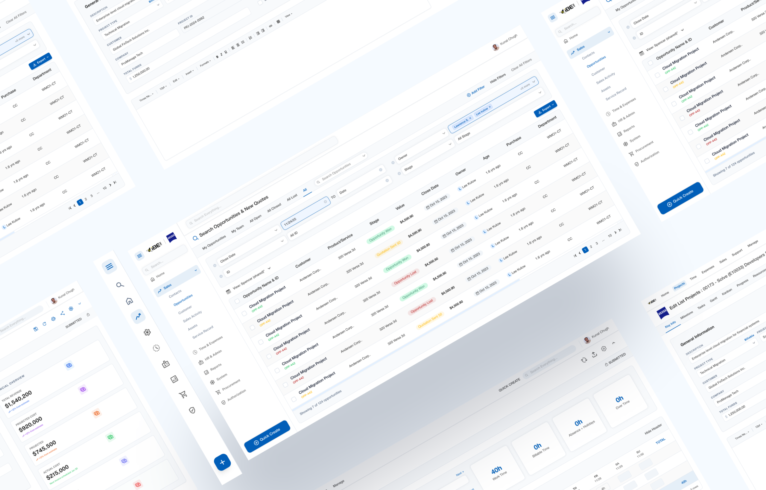
Information Architecture
Navigation was an important part of the redesign as iBE.net supports a large number of modules and workflows.
The existing product used top navigation, a familiar pattern for many enterprise users. To support newer users who are more accustomed to modern sidebar-based products, the redesign introduced a navigation preference in Settings.
Users can choose between:
Top Navigation →
Familiar enterprise experience
Left Navigation →
Modern, sidebar-based experience
Only one style is active at a time, keeping the interface clean while giving users the freedom to choose the navigation pattern they are most comfortable with.
The goal was not to replace the existing approach, but to make it more flexible for different generations and working preferences.
Redesigning Data-Heavy Interfaces
One of the biggest challenges was working with enterprise data.
Tables cannot simply be stripped down to look minimal because the information itself is essential to users.
The focus was therefore on making that information easier to scan and understand.
The redesign introduced stronger hierarchy through:
- Typography
- Spacing
- Grouping
- Status badges
- Avatars
- Secondary text treatment
- Column organization
- Consistent alignment
- Clear interactive states
The objective was to help users quickly scan large datasets and identify what needs attention without having to read every row in detail.
Rather than reducing the amount of information, the redesign focused on improving the way that information was presented.
This allowed the product to remain powerful for advanced users while becoming easier to understand at a glance.
From Desktop to Mobile
The redesign extended beyond desktop to mobile devices.
This required more than simply shrinking the desktop interface.
The mobile experience required rethinking:
- Navigation
- Content hierarchy
- Tables
- Forms
- Filters
- Actions
- Information density
- Touch targets
Complex desktop layouts were restructured into mobile-friendly interactions wherever necessary.
The goal was to preserve the core workflows while making them practical and intuitive on smaller screens.
Rather than forcing the desktop experience onto mobile, the redesign adapted the experience to the user’s context.
This included reconsidering how users access navigation, how information is prioritized, how actions are surfaced, and how dense enterprise data can be presented within a smaller viewport.
The result was an experience designed to feel like part of the same product across devices rather than a separate mobile interpretation of the desktop interface.
Building a Consistent Design Language
Another major part of the redesign was creating a more cohesive visual language across iBE.net.
The updated system follows consistent principles around typography, spacing, components, color, and interaction states.
The purpose was not to completely change the visual identity of the product. Instead, the focus was on refining what already existed and establishing stronger consistency between different product areas.
Typography
Clear hierarchy was established between page titles, section headings, labels, primary information, and supporting content. This makes it easier for users to understand the importance of different pieces of information within dense interfaces.
Spacing
A predictable spacing system creates rhythm, improves readability, and makes dense interfaces easier to scan. Spacing was used to create separation between groups while maintaining efficient use of screen real estate.
Components
Reusable components ensure that similar interactions look and behave consistently throughout the application. This also makes the system easier to maintain and scale as new areas of the product are introduced.
Color
Color is used intentionally for hierarchy, feedback, status, and emphasis rather than decoration alone. This ensures that visual emphasis communicates meaning and supports the workflow.
States
Hover, active, selected, disabled, loading, success, warning, and error states follow consistent patterns across the product.
Together, these decisions help iBE.net feel like a single, connected product while preserving the character and functionality of its existing experience.

The Real Impact of the Redesign
The most important outcome was not a new color palette or simply a cleaner interface.
It was the evolution of an already capable enterprise product into a more understandable and flexible system.
Through stronger information architecture, clearer visual hierarchy, reusable interaction patterns, responsive layouts, and established UX principles, the redesigned iBE.net experience makes the same powerful platform feel more connected and approachable.
The introduction of both top and left navigation also gave users more flexibility in how they move through the application.
Instead of assuming there is only one ideal way to navigate an enterprise product, the redesign supports different working styles and contexts.
This was especially important as the platform continued to expand across multiple modules and increasingly complex workflows.
Reflection
Working on iBE.net highlighted that enterprise design is less about removing complexity and more about organizing it effectively.
The redesign started with what already worked, identifying opportunities to improve consistency, efficiency, and adaptability rather than starting from scratch.
One of the key areas was navigation. The existing product used top navigation, while the redesign introduced a setting that lets users choose between top and left navigation based on their preference and familiarity.
The biggest challenge was not redesigning individual screens, but creating consistency across the entire ecosystem while respecting the product’s existing foundation.
This meant looking beyond individual interfaces and thinking about how navigation, components, workflows, information architecture, responsive behavior, and visual language could work together as one system.
Final Takeaway
The redesign of iBE.net was a product-level exercise spanning UX, UI, information architecture, responsive design, navigation, and design systems.
From Dashboard and Search to Timesheets, Opportunities, Customer Portal, Jobs, Reports, and administrative workflows, the objective remained consistent:
Build on a strong existing foundation and evolve it into a clearer, more flexible, and more connected enterprise experience.
The project was not about replacing the identity of iBE.net.
It was about understanding the product, respecting what already worked, and introducing thoughtful improvements that could help it continue evolving with its users and business needs.